I’ve been blessed with a life full of outdoor adventure. A rich and genuine connection with nature has been an invaluable source of well being in my life. I wouldn’t be who I am today without it. Knowing this I moved into an amazing career in Wilderness Therapy where I’ve had the privilege of guiding and witnessing people gain great perspective, balance and deep healing through their experiences and interaction with the natural world.
Read moreRicardo Da Cunha
Long as I recall I have had a deep appreciation for, and a willingness to help protect, our remaining wilderness areas and the fragile life that they support. It's this desire that fuels the choices that I make in my life and it's the one of the key reasons that I joined The Light Collective, where as a collaborative, we stand to speak a louder voice for our ailing environment by combining our artistic capabilities.
Read moreIgnacio Palacios
The Great Barrier Reef was the first natural wonder that I saw when I came to Australia for the first time back in 2007. I was absolutely amazed by its remarkable beauty.. I've been lucky enough to photograph it from a helicopter and also from its pristine waters. The reef and marine life was nothing short of incredible. It was one of the most amazing natural wonders I have ever had the pleasure of experiencing.
Read moreAdam Williams
I am sorry that the struggles you have to deal with today are due to the previous generations misuse of the environment. I'm am sorry I didn’t do more to help turn the denigration around. I was just so busy trying to survive, stressed just trying to provide for us, trying to put a roof over our heads, trying to lay a financial foundation to make your life a little easier.
Read moreFinal Kati Thanda-Lake Eyre Exhibition & Workshop - Melbourne - June 5 - 16, 2018

After much success and media attention, nationally and internationally, The Light Collective will be holding their last ever exhibition titled ‘Kati Thanda-Lake Eyre’ in Melbourne between the 5th and 16th of June, 2018 with the opening night taking place on Thursday June 7th from 5pm to 7pm.
Kati Thanda-Lake Eyre is the first in a series of projects by The Light Collective exploring modern and progressive interpretations of Australia’s unique and arresting wild places.
The exhibition will feature large scale striking interpretive aerial imagery from one of the most alluring regions of the Australian interior – Lake Eyre.
Ancient almost beyond imagining, Lake Eyre with its compelling atmosphere and intricate complexity has provided both a perfect invitation and a vast stage for The Light Collective to apply their considerable skills and creative vision.
We cordially invite you to attend the final leg of the Kati Thanda-Lake Eyre exhibition. Full details have been provided in the formal invitation in this post.
Books will be available for purchase on the night or alternatively online here.
A Day with The Light Collective workshop will accompany this exhibition and take place on Saturday 9th June. Click here for more details and to book.
We hope to see you there!
New Tour Announced - Mongolia in Sept 2018 →

The Light Collective members Ignacio Palacios and Ricardo Da Cunha are teaming up to run a photography tour in Mongolia in late Sept 2018.
Mongolia has amazing landscapes and a nomadic culture offering a stunning array of photographic opportunities. Travel through the vast steppe to capture images of its horses, traditional ger camps, and camel-herding families. Catch the towering dunes of the Gobi at sunrise and the brilliant Flaming Cliffs at sunset, and spend an amazing time photographing the Golden Eagle Festival, one of Mongolia’s most celebrated festivals.
Read moreNZ South Island in Autumn Photography Tour - April 21-30, 2017

The Light Collective members Ricardo Da Cunha and Luke Austin will be leading a special 10 day tour of New Zealand’s South Island during Autumn 2017. This tour will concentrate on capturing the best possible fall colours and will coincide with the famous Arrowtown Autumn Festival. We will visit and photograph some of the most colourful landscapes of the South Island including Arrowtown and Twizel. In addition, this extended tour will allow us to visit the Catlins region and the east coast where we’ll photograph the dramatic landscapes of Nugget Point and Moeraki Boulders.
Read moreA Day with The Light Collective - Nov 5, 2016
You are invited to enjoy an intimate day of learning, inspiration and insight into the minds and vision of some of the finest and most progressive landscape photographers in Australia today.
Read moreKati Thanda-Lake Eyre Exhibition - Nov 3 - 12, 2016
The Light Collective will be holding their inaugural exhibition and book launch titled ‘Kati Thanda-Lake Eyre’ in Sydney between the 3rd and 12th of November, 2016 with the opening night taking place on Nov 3 from 6pm to 9pm.
Kati Thanda-Lake Eyre is the first in a series of projects by The Light Collective exploring modern and progressive interpretations of Australia’s unique and arresting wild places.
The exhibition will feature large scale striking interpretive aerial imagery from one of the most alluring regions of the Australian interior – Lake Eyre.
Read moreNew Book Release - Kati Thanda-Lake Eyre

The Light Collective are proud to announce that our first ever book publication: 'KATI THANDA–LAKE EYRE - Interpretations from the air' is now available for pre-order
Read moreContrast is king

Contrast is king
If Contrast was in fact the king of visual communication, then possibly he is only trumped by the beautiful Queen Symmetry. We will take a look at symmetry at a later date.
If symmetry is the one element above all else that the human eye finds most attractive, then contrast would be the single element that the human eye finds the most interesting.
--------------------------------------------------------------------------------------------------------
contrast
noun
noun: contrast; plural noun: contrasts
ˈkɒntrɑːst/
1. the state of being strikingly different from something else in juxtaposition or close association.
--------------------------------------------------------------------------------------------------------
When we think about contrast within photography, we generally think about tonal contrast. Tonal contrast is what us photographers are referring to when we’re talking about adding or reducing the contrast within an image.
However, contrast by no means stops there. In fact, tonal contrast only just scratches the surface of the types of contrasts we can use to make our photography much more interesting.
This is not something I have pulled from thin air; the power of difference, variance or “contrast” has been around for as long as art itself.
How often have you seen a photo of the odd one out? Google “Odd one out.” click on the image tab, and you will see the types of photos I am referring to. The interest that these images create is contrast at play.
Let’s break these forms of contrast into subgroups:
Compositional or in camera – types of contrast we can capture in camera
Post-processing – types of contrast we can apply within post-processing
Conceptual – Conflicting stories we can imply within our photography
Compositional Contrast (contrasting elements)
Rough v smooth
Sharp v blurry
Still v movement
Big v small
Shinny v dull
Old v new
Square v circle
Straight v curve
Symmetry v Asymmetry
Processing Contrast (contrasting effects)
Tonal contrast – high contrast v low contrast
Light contrast – Dark v light
Saturation contrast – High saturation v low saturation
Colour contrast – Complementary, cold v warm, others
Detail contrast - sharper v softer
Conceptual Contrast (contrasting stories)
Happy v sad
Many v none
Have v have not
There would be many more. I’m sure you have thought of a couple already; however, the point is, whatever we call it – contrast, variation, difference – is the foundation for interesting photography. In fact, there could be a case made that contrast is the foundation for almost everything interesting full stop.
Compositional Contrast
Looking for contrast within your compositions can be an excellent way to improve the interest level within your photos.

Here is a great example of compositional contrast. The first and probably the most obvious is the rough texture of the rocks v the smooth texture of the sand and water.
- Very strong light contrast on the main triangular rock: light side v dark side.
- There is symmetry contrast with the strong symmetry of the triangular rock against the asymmetric position of that rock within the frame.
- Line contrast with the flat, straight horizon being broken by the rough outline of the rocks.
- Shape contrast: the strong triangle v the lack of any other shape
- Shape Contrast: the contrast of the triangle v the rectangular frame of the photo.
- The dark rock against the bright surroundings.
- The white soft line of the long-exposure water v the dark sharp line of the horizon.
I would be lying if I told you that I consciously saw all of these elements when composing this photo. I can clearly remember that this position was the composition that jumped off the rear LCD much more than any other shot that I composed that day. This definitely has to do with the shape and symmetry of the pinnacle rock from this exact spot. The choice of shutter seep is also interesting because I will usually do several different speeds; however, more often, it’s the longer speeds with the smooth water that look the most interesting – the contrast of smooth v rough.
Processing Contrast
When processing my images, the 3 main types of contrast I find particularly useful in leading the viewers are light, tonal contrast, and saturation.
Light (More or less light): As a type of contrast, light contrast would be the difference between a light area and an area of dark within an image. By adding light, we can attract attention to an area, or conversely by removing light or darkening an area we will tend to divert attention from that area.
Tonal contrast (more or less contrast): Tonal contrast is the more commonly referred to contrast within photography. When photographers talk about contrast, we are talking about tonal contrast. Generally speaking, to add more tonal contrast is to create a large distance between the light pixels and the dark pixels within a photo. Lighten the lights and darken the darks. To lower tonal contrast within a photo would be to create less distance between the lights and the darks. Darkening the lights and lightening the darks would reduce the overall tonal contrast of a photo.
Saturation (more or less colour saturation): Saturation as a contrast element would be the difference between highly saturated areas and the low saturated areas of a photo.

Attracting the attention of your viewer’s eye using these three forms of contrast is actually quite simple. By adding more of any of them to a specific area of our photograph (more light, more tonal contrast or more saturation) will have the effect of drawing attention to that specific area. Taking away light, tonal contrast or saturation will have the opposite effect of allowing these areas to fade into the background, as these areas will appear less interesting to your viewers.
I must highlight the fact that removing contrast interest from the surroundings is at least as equally important as adding contrast interest to your main subject. In fact, in the case of saturation contrast, I will very rarely add extra saturation; however, I will almost always remove at least a little saturation from the areas surrounding my interest point (main subject).
Let’s take a look at some examples where the above techniques are clearly visible.

Camel Rock, Bermgui NSW
Hopefully you have noticed the prominence of the central rocks within this photo and as we are discovering. This is by no fluke.
Let’s look at the types of contrast at work here:
Light contrast – notice the lightest areas of this photo are the main subject itself or located directly around and in relation to the main subject. You will also notice the edges of the photo, where I would prefer the viewer not be overly attracted to, are very dark indeed.
Tonal contrast – again the area that shows the highest amount of tonal contrast is the main subject itself. And also note the edges of the photo, although very dark, have very little tonal contrast.
Saturation contrast – notice the main subject and the area directly surrounding the main subject are the areas with the highest colour saturation, albeit not particularly high saturation. It’s all relative, as you will note the extreme edges of the photo are completely void of any colour at all.

Boat Shed, Perth WA
Hopefully once again your eye is drawn to the boatshed in this particular photo.
Again note:
The centre of the image here shows the brightest areas, the highest colour saturation and also the highest area of tonal contrast (the point at which light and dark are at the closest proximity to each other).
Whereas the edges of the image contain;
- Very little, if any bright areas
- Next to no colour saturation
- Apart from the walkway leading into the photo, the edges contain very little tonal contrast.
Using these 3 forms of contrast, we can create very powerful photos that grab the viewer’s eye and lead it directly into the central subject matter.
For further information on learning how to easily process your photos for maximum impact, click the link below.
Adam Williams Photography
www.australianphotographer.com
Conceptual contrast
Conceptual contrast deals with conflicting stories or themes within a single photo.
To name just a few:
Happy v sad
Despair v hope
Love v broken heart
This is a relatively new concept to me too and, as I develop my conceptual contrast skills, I will revisit with more in-depth thoughts. In the meantime, let’s look at an image of mine where I have attempted to use conceptual contrast.
Again I will use this photo from camel rocks in Bermagui NSW as the example. In this photo, the main conceptual contrast that I wanted to portray was quite a heavy, depressing scene with the ray of light representing hope.

There is also another possible storyline containing conceptual contrast, that being one of isolation v companionship. The three rocks themselves are quite isolated within the image, but within that we also have the smaller rock of the three separated from the embrace of the other two. Once again, I didn’t consciously see this at the time of making the photo. It all may seem a bit far-fetched, but at the end of the day, the more stories that we consciously place within our photos, the greater chance that our viewers will make their own interpretation and connect with our work.
Cheers, Adam
A photographer's paradise.

Never-ending sunrises/sunsets, a photographer’s paradise
I had been to Lofoten in the summer of 2004 on a two month camping trip around Scandinavia, and when I arrived to these Islands, north of Norway, I fell completely in love with the power of this landscape and with the size and shape of the mountains and peaks. I had always dreamt of coming back and I had the opportunity to go last February.
Read moreThe Experience of Patagonia
A short write-up on the experience of visiting Torres Del Paine National Park in the Patagonia region of southern Chile along with a few tips by Ricardo Da Cunha.
Read moreA Grand Canyon Journey

An entertaining write-up on Paul Hoelen's once in a lifetime adventure where Paul water kayaked, pack-rafted, rubber-duckied, swum, canyoneered, free climbed, camped, white water rafted and photographed the full length of one of the greatest geological features on this Earth – the mighty Grand Canyon in the USA.
Read moreThings are in the hatching...
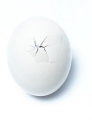
Welcome to The Light Collective. We've just kicked things off as a new creative collective and we're busy making plans...
Read more